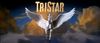
1st Logo (1984-1993)[]
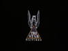
Nicknames: "The TriStar Pegasus", "'80s Pegasus", "Pegasus of Doom"
Logo: On a black background, we see a stylized Pegasus "jumping" over the gold triangle with a blue/purple gradient inside it. Inside the triangle is "TRI STAR" and "PICTURES" below.
Trailer Variants:
- Usually, it is the print logo.
- Sometimes, it is the finished product of the logo.
Closing Variants:
- 1984-1991, 1993: It's the same logo (minus the colors) with "A Tri-Star (or TriStar) Release" above or below the logo.
- 1991-1992: The print logo now has the little "Pegasus Over Pyramid" print logo (without the words inside) with "TRI STAR" next to it with "A TriStar Release" or "Released by". Usually, it has the rectangular box below it, but it lacks the "TELEVISION" text below it.
FX/SFX: The stallion galloping, spreading its wings, the stars, the Pegasus flying, the text and triangle zooming out.
Music/Sounds: An orchestrated piece done by Dave Grusin. When the stallion appears, three low French horn notes play and they repeat. When the Pegasus flies, more enlightening French horn notes play combined with the trombone. Sometimes, the music echoes after the logo ends. On the 2004 Lions Gate DVD of Universal Soldier, the music is barely audible, possibly due to a printing error. On TBS airings of Matilda, the 1993 music is heard, due to a reverse plaster error. Sometimes, it is silent. On rare occasions, if at all, the opening theme is used.
Availability: Fairly common. Seen on very early movies from TriStar Pictures.
- The first film with this logo was Where the Boys are '84.
- The last film with this logo was Cliffhanger.
Scare Factor: Low to nightmare. The loud music at the end might probably get to more than a few.
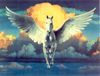
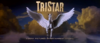
2nd Logo (1993-2015)[]


_Blur_Faddoms.jpg)
_Widescreen.png)
.jpg)
Nicknames: "The TriStar Pegasus II", "'90s Pegasus", "Pegasus of Doom II", "Ultra Common Pegasus"
Logo: On a black/blue gradient background, we see some golden clouds with fog on the bottom. A Pegasus is in front of the clouds with "TRISTAR" above.
Trailer Variants:
- 1993: The print logo.
- 1993-1999: The finished product of the logo, except that "TRISTAR" doesn't shine.
- 1999-2015: The finished product of the normal logo.
Closing Variants:
- 1992-1993, 2014, 2017-: One early closing variant such featured the boxed Pegasus at center with "TRISTAR PICTURES" and the SPE below one another. This closing variant is seen at the end of Chaplin and Cliffhanger, which both used the old logo at the beginning, though this may be unsurprising, although the latter was the last film to use the old logo at the beginning.
- 1993-2016: It's the same exact current print logo that appeared on trailers and commercials during its early years with "A TRISTAR RELEASE" below (or "RELEASED BY" above) with the SPE byline underneath. Sometimes, "A TRISTAR RELEASE" isn't there. Sometimes, it's bylineless. Starting in 2014, the phrase now reads "A TRISTAR PICTURES RELEASE" and the byline is shortened to "a Sony Company".
Byline:
- 1993-1999: (bylineless)
- 1995-2014: "a SONY PICTURES ENTERTAINMENT company" (first used on Jumanji, the byline is blue on its first appearance, but starting with Mary Reilly, the byline is gold. Starting with Sparkle, the byline is smaller, a bit darker and is slightly off-center.)
- 2014-2015: "a Sony Company"
Variants: A treasure trove. Here are a few variants, and of course the two byline variants.
- There is a print artwork logo where it is the same exact painting in 1992.
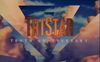
- In 1992, TriStar made the biggest variation with "10TH ANNIVERSARY" below the "TRISTAR" text. No Pegasus is used in this variation.
- A prototype version exists with a darker tint.
- Starting in 1998, the logo has been enhanced with lighter clouds.
- Starting in 1995, the SPE byline is added below the logo in gold.
- On Jumanji, the byline is in blue. This is used as a prototype.
- Starting in 2007, the logo is enhanced once more.
- Starting in 2012, the byline is updated. Sometimes, it is extra small.
- Starting in 2014, the byline is shortened to "a Sony Company".
FX/SFX: The background brightening, the flash, the Pegasus and the "TRISTAR" text fading in.
Music/Sounds: A more majestic remix of the first jingle, composed by Bill Johnston. Starting in 1998, the music is rearranged. Sometimes, it is silent or the film's music is heard.
Music/Sounds Variants:
- On earlier films with this logo such as Sleepless in Seattle, Jury Duty and Magic in the Water, the 1984 fanfare plays.
- On Little Secrets, the logo is high-pitched.
Availability: Ultra common. Used as a fan-made de-facto home video logo.
- The bylineless logo can be seen from 1993 until 1999.
- The Sony Pictures Entertainment logo can be seen from 1995 until 2014.
- The Sony logo can be seen from 2014 until its end.
- The first film to use this logo was Sleepless in Seattle.
- The last film to use this logo was War Room.
Scare Factor: Depends on the variant.
- Normal: None to low.
- With the 1984 music: Low to nightmare.
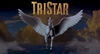
3rd Logo (2015- )[]
_logo.png)
Nicknames: "The TriStar Pegasus III", "'2010s Pegasus"
Logo: Same as the last logo, except that it is less improved with some changes:
- The Pegasus looks different.
- The clouds are white
- "TRISTAR" has more gold in it.
Trailer Title: The ending product of the logo.
Closing Variants: Same as the last logo.
Byline: Referred to as "a Sony Company"
FX/SFX: Same as the last logo, but with the zoom-in with some elements of the 1st logo.
Music/Sounds: Same as the previous logo. Sometimes, the opening theme is used. On rare occasions, if at all, it is silent.
Availability: Current. Used as another fan-made de-facto home entertainment logo. It debuted on The Walk and has been placed in front of TriStar films for 3 years.
Scare Factor: Low. It's a worthy successor to the previous logo.